Branding
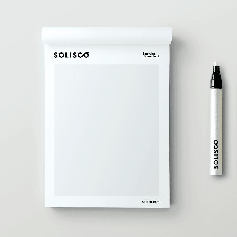
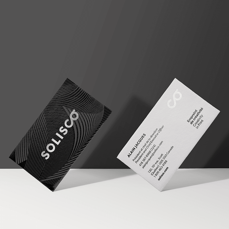
Solisco Branding
Context
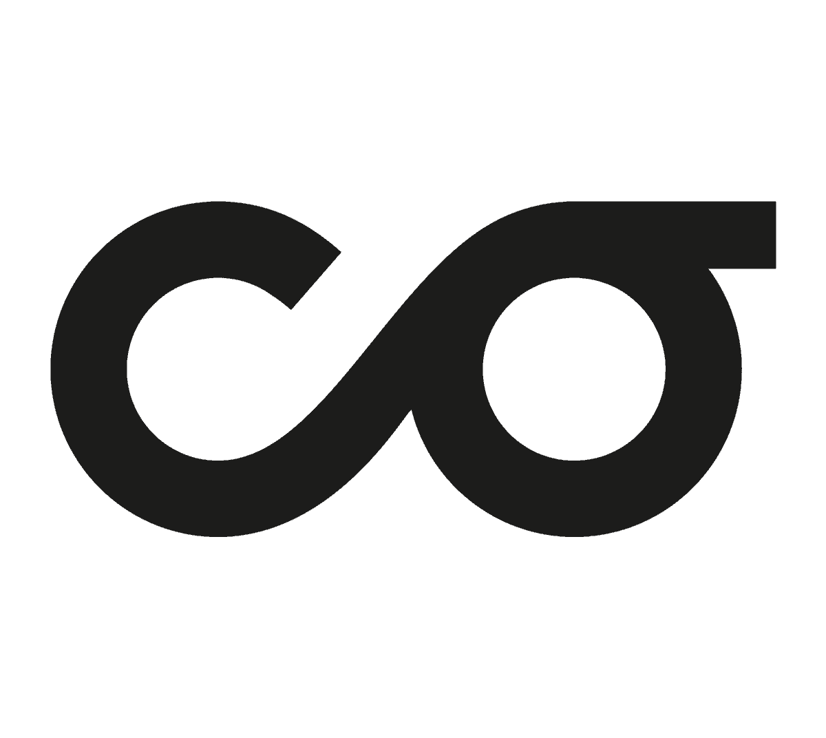
It’s based on Solisco’s three major pillars that Maison 1608 built the rebranding of its parent company, one of the largest printers in Canada: expertise, sustainability and people. The logo conceived by Maison 1608 suggests both the infinity symbol and press rollers.
Strategy
It can also be read as the letters CO, as reference to partnership, dialogue and collaboration between employees, clients and partners. This strong, imaginative, and evocative logo illustrates, in an accurate and original way, the personality of the company and the values it wishes to bring into focus.