Branding
16.08 Magazine
Maison 1608
Context
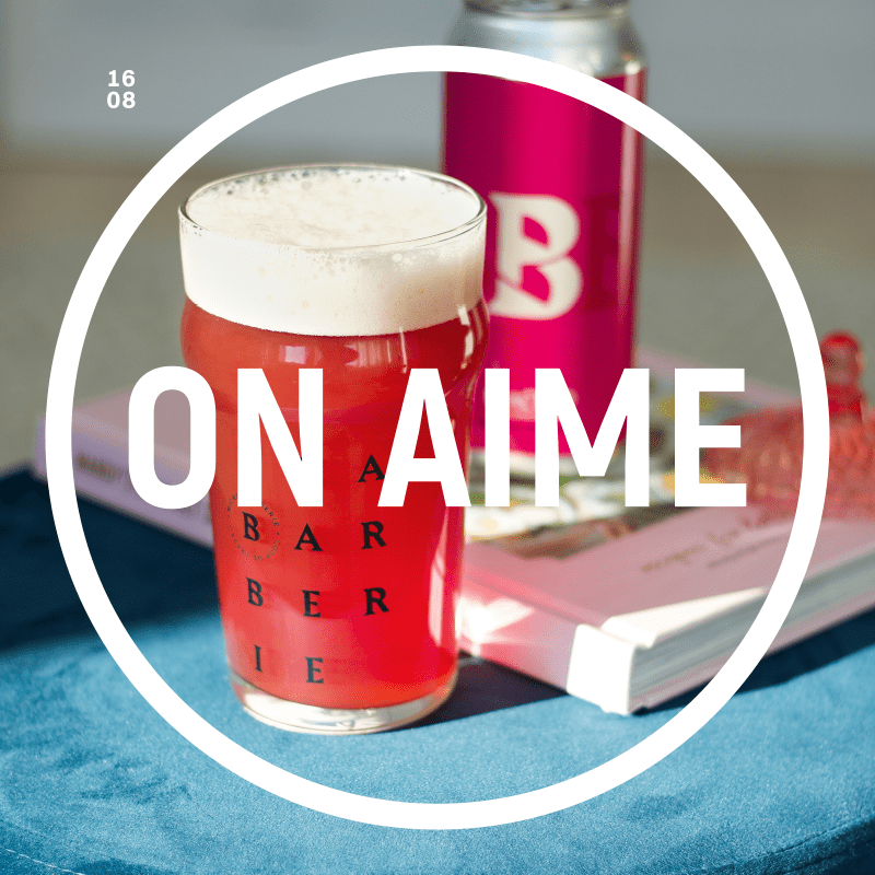
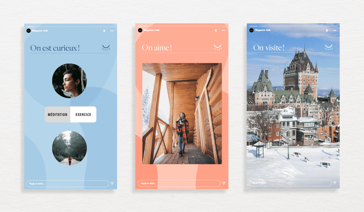
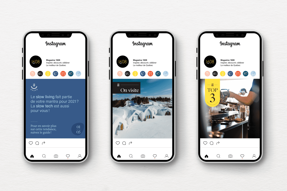
To bring a touch of beauty and something fresh to 2020, Maison 1608 decided to bring Magazine 16.08 back to life. This in-house publication, created by the Maison team from A to Z, showcased the inspiring and daring initiatives at play in Québec City over the course of five years. The magazine is now back on Instagram, but its branding needed to be spruced up and tailored to the platform.
Strategy
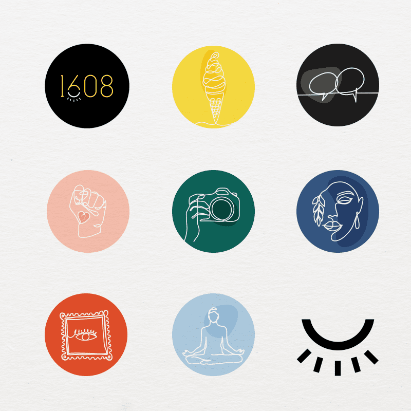
By going with yellow, the magazine’s emblematic colour, the studio modernized the logo, opting for a sans typography with a slight serif on the 1. The curves amplify the date’s aesthetic qualities and the colour accent makes the graphic element standout from the rest of the logo. The eye is a symbol for discovery, the whole purpose behind the magazine, which makes sure its readers find out about the best Québec City has to offer. As exciting as ever, Magazine 16.08 is ready to conquer Instagram!